Project Summary
DailyCare – Mobile App for Health Habit Tracking
Role: UX/UI Designer
Timeline: 4 weeks
Tools Used: Figma, Adobe Photoshop
The Problem: Lack of Unified, Accessible Tracking
Managing medications, hydration, symptoms, and daily habits can feel overwhelming without a simple, centralized tool. Many health tracking apps create barriers rather than solutions:
- Neurodivergent users may feel overloaded by cluttered layouts or too many steps to log information.
- Older adults often face small text, low contrast, or overly complex navigation.
- Busy parents don’t have time to learn complicated features; they need quick, intuitive tools.
The challenge was to design an app that delivers multiple tracking functions while staying clean, approachable, and easy to use every day.
The Goals: Clear, Measurable Outcomes
DailyCare was built with a single mission: make daily health management simple, accessible, and motivating for a wide range of users.
Simplicity First → Reduce cognitive load by minimizing steps and keeping layouts clean, clear, and intuitive.
Universal Accessibility → Ensure inclusivity through WCAG-compliant design choices (legible typography, high contrast, logical navigation).
Consistent Experience → Build predictable flows and reusable design patterns to help users engage daily without friction.
User-Centered Impact → Address needs of neurodivergent users, older adults, and busy parents by creating flexible, easy-to-use tracking tools.
Research & Insights
User interviews revealed three key needs for an effective health tracking experience:
1. Clarity Encourages Use – Fewer steps and an uncluttered interface lead to more consistent logging.
2. Accessible for All – Large, legible text, high contrast, and logical navigation benefit users across ages and abilities.
3. Predictable Flow Reduces Effort – Consistent patterns and layouts help users quickly find what they need without overthinking.
These insights shaped every design choice, from button sizing to navigation structure.
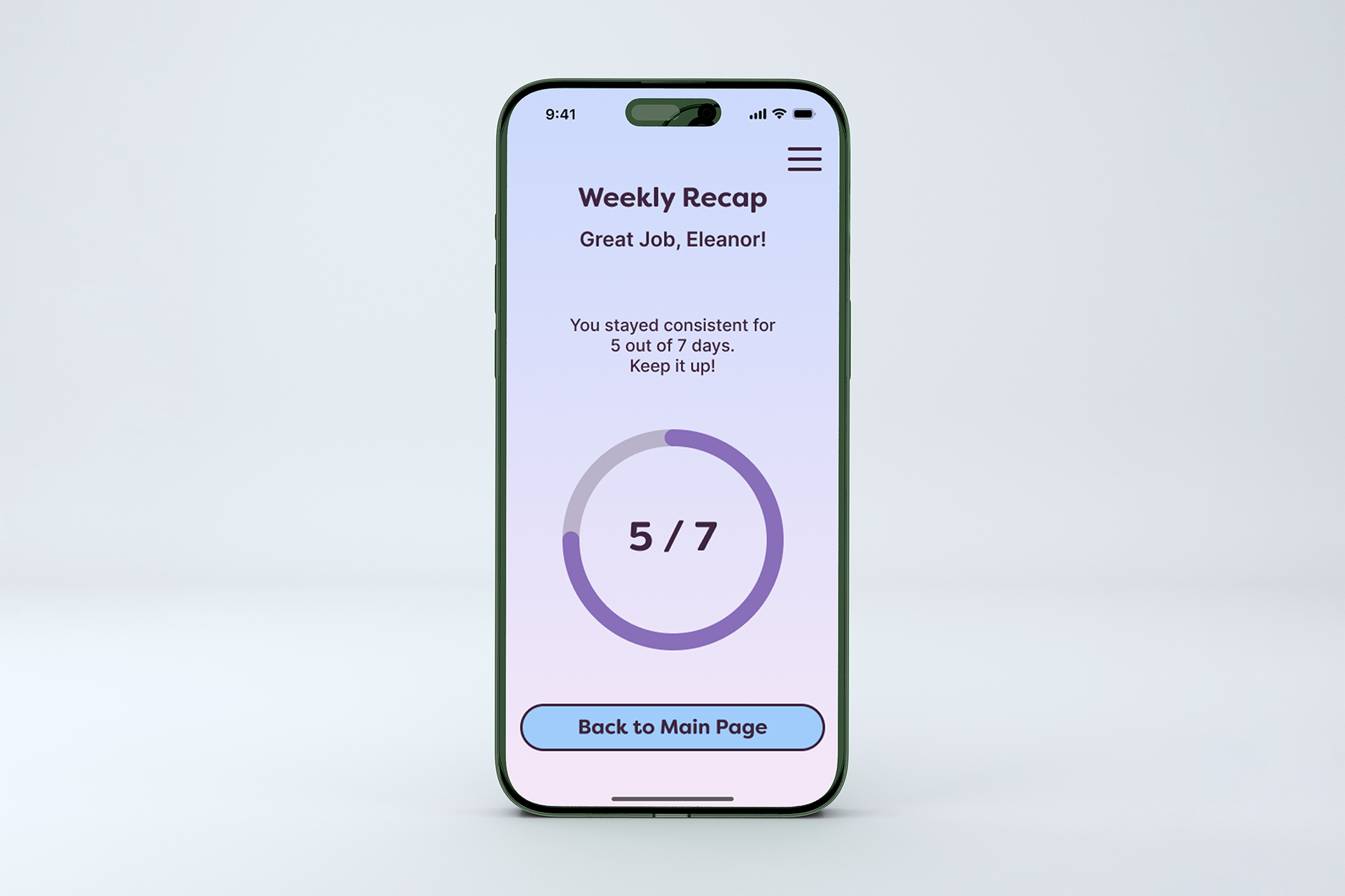
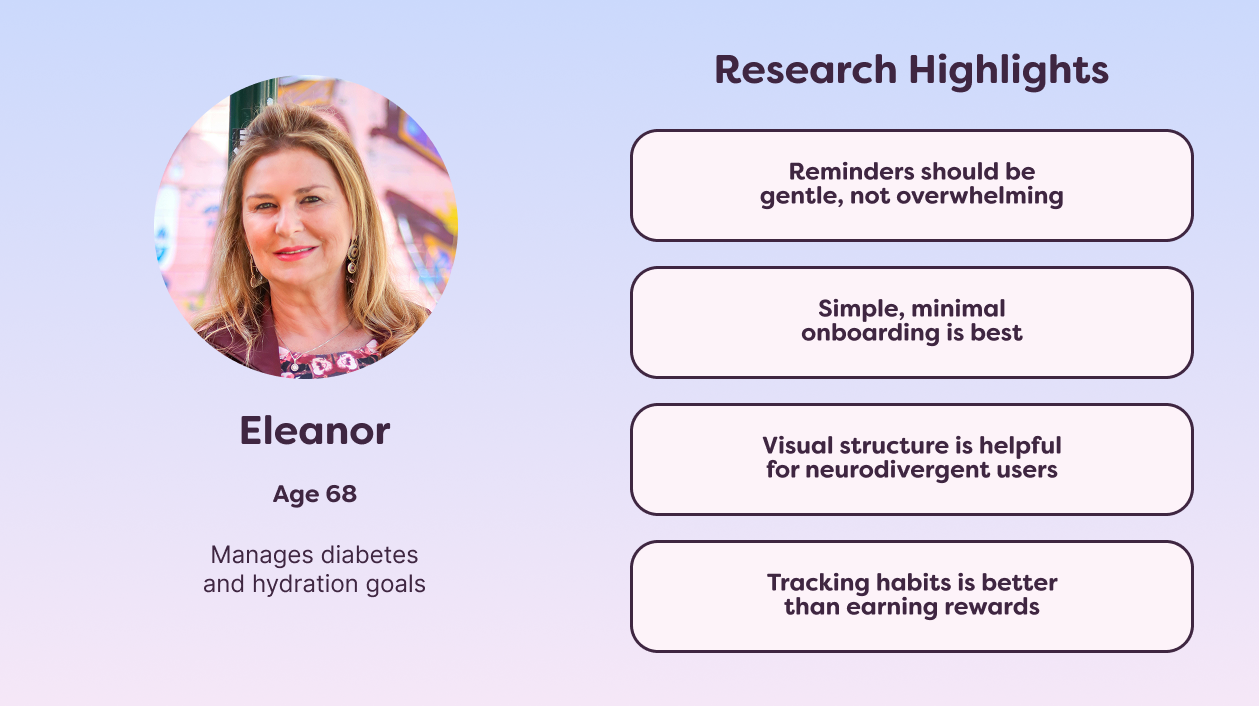
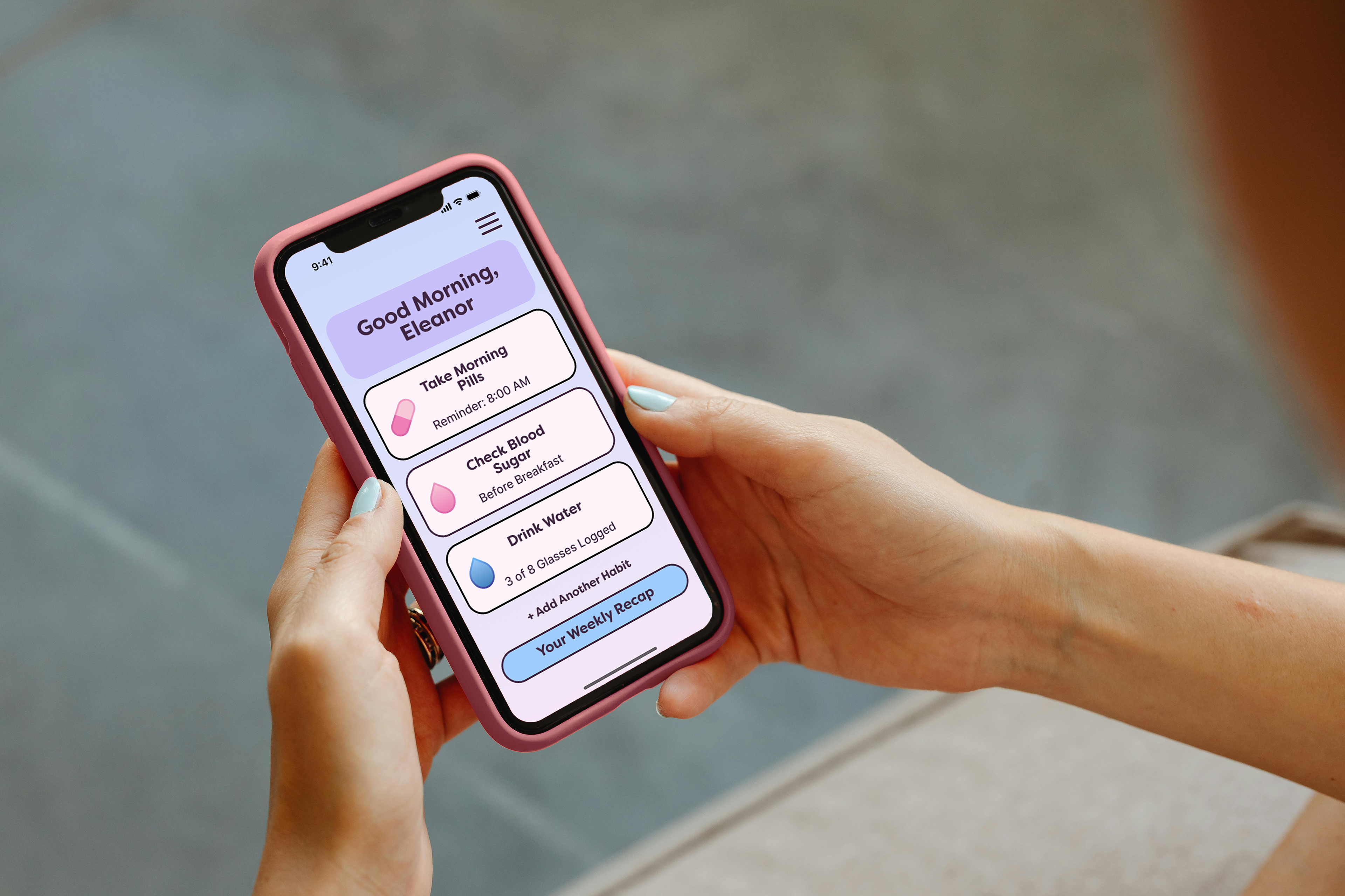
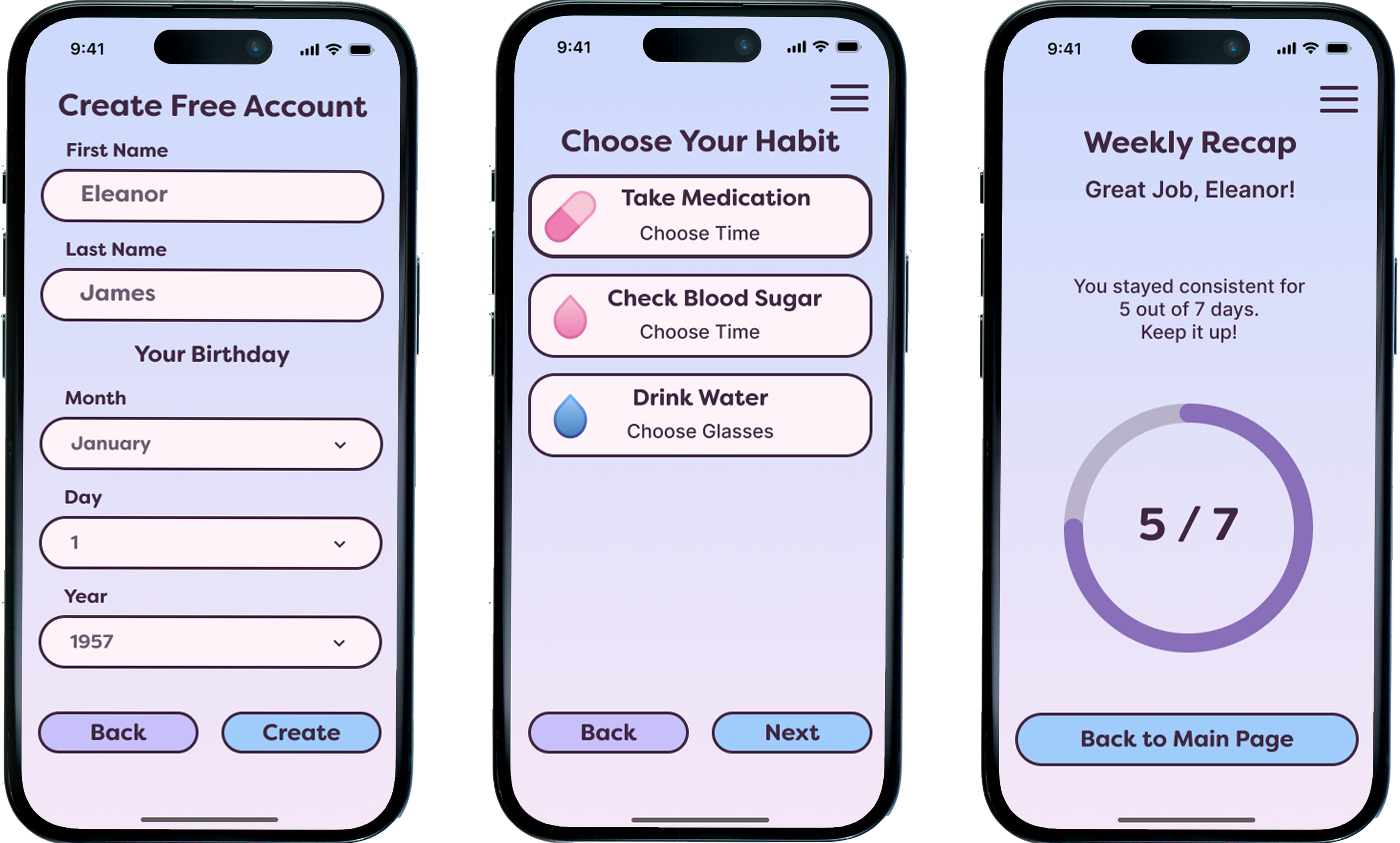
To keep the design grounded in real-world needs, I created Eleanor, a fictional persona representing one of DailyCare’s primary user groups: older adults managing multiple daily health routines.
Eleanor's Profile
- Age: 68
- Occupation: Retired teacher
- Goals: Stay consistent with medications, hydration, and daily walks.
- Challenges: Small text and cluttered interfaces make it harder to use apps; prefers clear, simple navigation and larger touch targets.
- Motivation: Wants to feel in control of her health and maintain independence.
Eleanor’s needs guided many design decisions, from typography size and color contrast to simplifying the number of steps for logging activities.
Design & Testing
DailyCare’s flow was built for speed, clarity, and minimal friction.
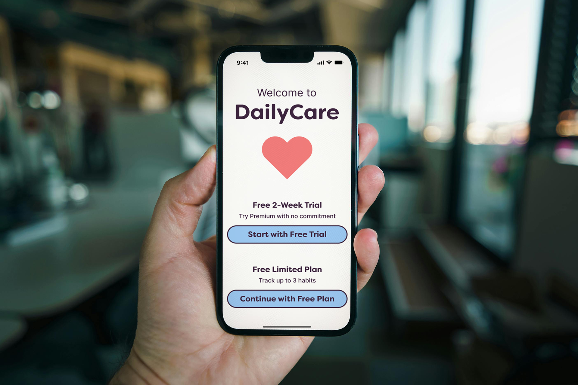
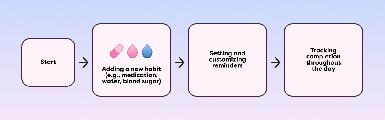
1. Onboarding – New users answer a few quick questions to personalize their experience, then immediately see their main dashboard.
2. Logging Data – Hydration, medication, mood, and other entries can be logged with one or two taps.
3. Viewing Progress – Data is visualized in clean, easy-to-read charts that encourage consistency without overwhelming the user.
4. Reminders & Notifications – Gentle, customizable reminders prompt users to stay on track without feeling intrusive.
This streamlined flow ensures users can go from app open to completed action in seconds, encouraging regular use and building long-term habits.
The DailyCare app was guided by three core principles from the start:
1. Simplicity – Easy to Use
Every interaction should feel effortless. Clear labels, minimal steps, and predictable navigation keep the experience approachable for users of all tech comfort levels.
Every interaction should feel effortless. Clear labels, minimal steps, and predictable navigation keep the experience approachable for users of all tech comfort levels.
2. Accessibility – For Everyone
Colors, typography, and layouts were chosen to meet accessibility standards, ensuring the app works for users with different vision, motor, and cognitive needs.
Colors, typography, and layouts were chosen to meet accessibility standards, ensuring the app works for users with different vision, motor, and cognitive needs.
3. Consistency – Keep on Track
A unified visual language and predictable component behavior help users feel confident as they build daily habits.
A unified visual language and predictable component behavior help users feel confident as they build daily habits.
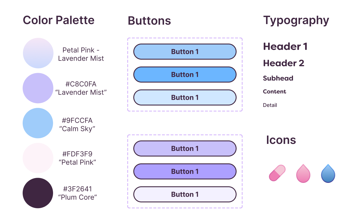
These principles acted as a compass throughout the design process, shaping decisions from the color palette to button placement.
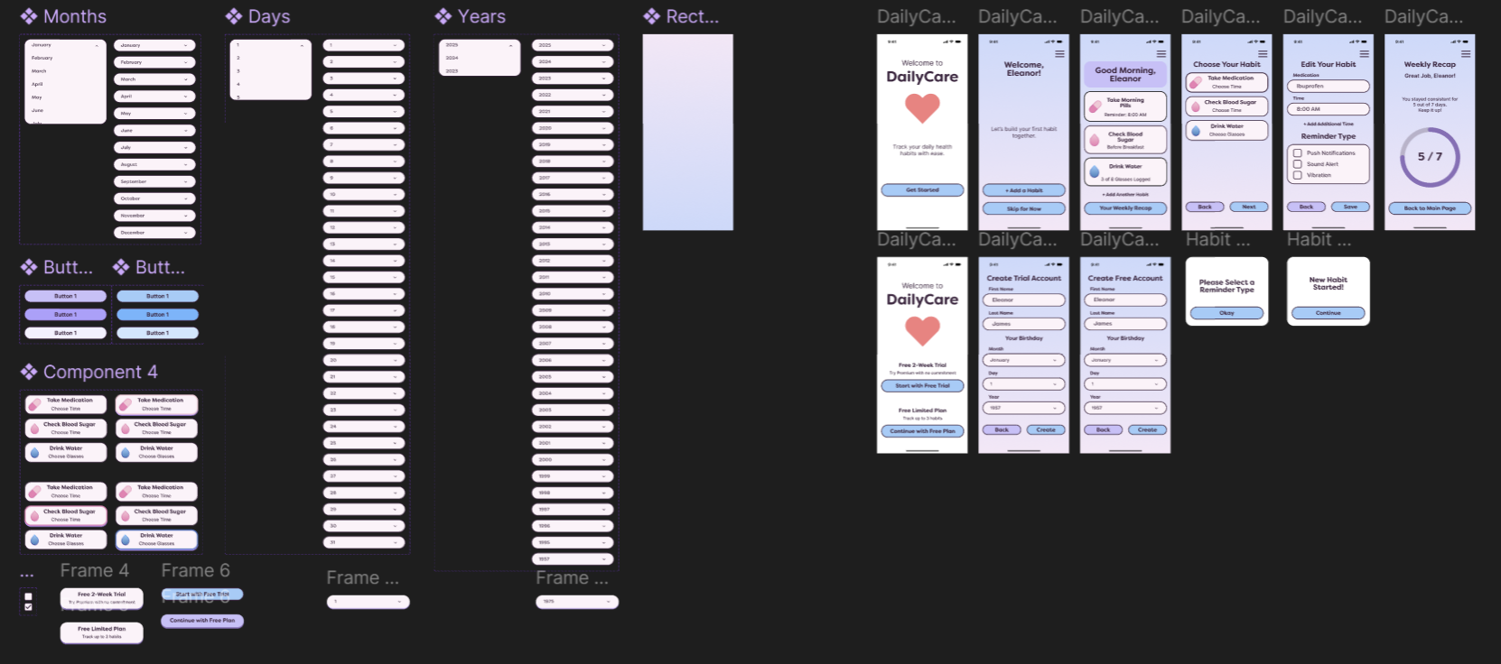
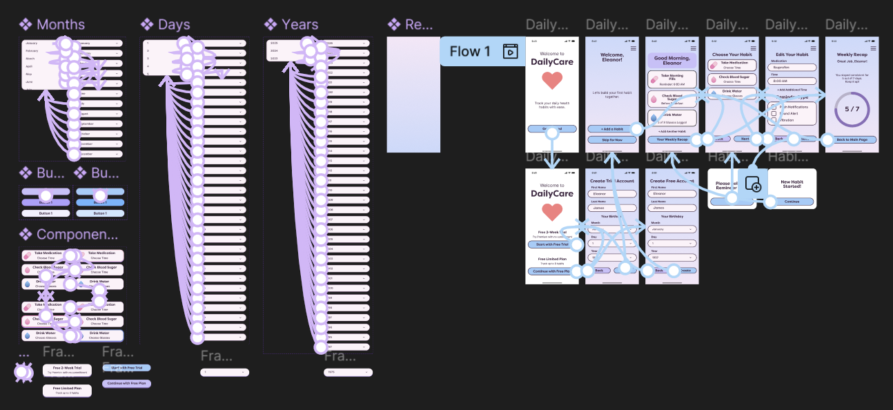
I focused on making the prototype feel as close to the final app as possible. Buttons responded with clear states (default, pressed, disabled), toggle switches updated instantly, and the birthday month selector used a smooth vertical scroll for accessibility. The reminder options could be toggled on and off with minimal effort, creating a satisfying and intuitive interaction.
By testing these micro-interactions early, I was able to spot small usability improvements such as refining button outlines for better contrast instead of drop shadows and adjust before high-fidelity polishing.
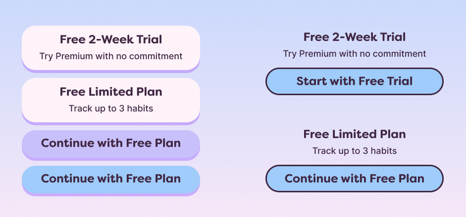
During early prototype testing, I focused on how easily users could navigate core features such as adding habits, setting reminders, and editing details. Observations showed that while the app was intuitive overall, some UI elements could be improved for clarity and accessibility.
One key adjustment was replacing button drop shadows with outlined styles, which improved contrast and gave the interface a cleaner, more modern look. The reminder toggles were adjusted for a more prominent active state, and the birthday month selector was refined to make scrolling smoother on mobile devices.
These refinements, though small, created a noticeably smoother experience and aligned with the app’s goals of simplicity, accessibility, and consistency. Each change was made with the intent to remove friction, making the process of tracking daily health care as effortless as possible.
High-Fidelity Design Solution
The final version of DailyCare brings together all the refinements from research, feedback, and iteration. The interface is clean and approachable, with a consistent visual style that keeps focus on the content. Each screen is designed with accessibility in mind, using clear typography, high-contrast elements, and intuitive navigation to ensure that users of all ages can engage with the app easily.
Key flows such as adding a habit, setting reminders, and reviewing progress have been streamlined to minimize taps and keep actions simple. The color palette supports a calm and supportive atmosphere, while outlined buttons and clear iconography give the app a modern, polished feel.
The result is a health-tracking tool that is both functional and enjoyable to use, aligning with the original vision of simplicity, accessibility, and consistency.
Outcomes & Results
Streamlined Onboarding → Reduced the number of steps and simplified navigation so users could begin tracking habits more quickly and with less confusion.
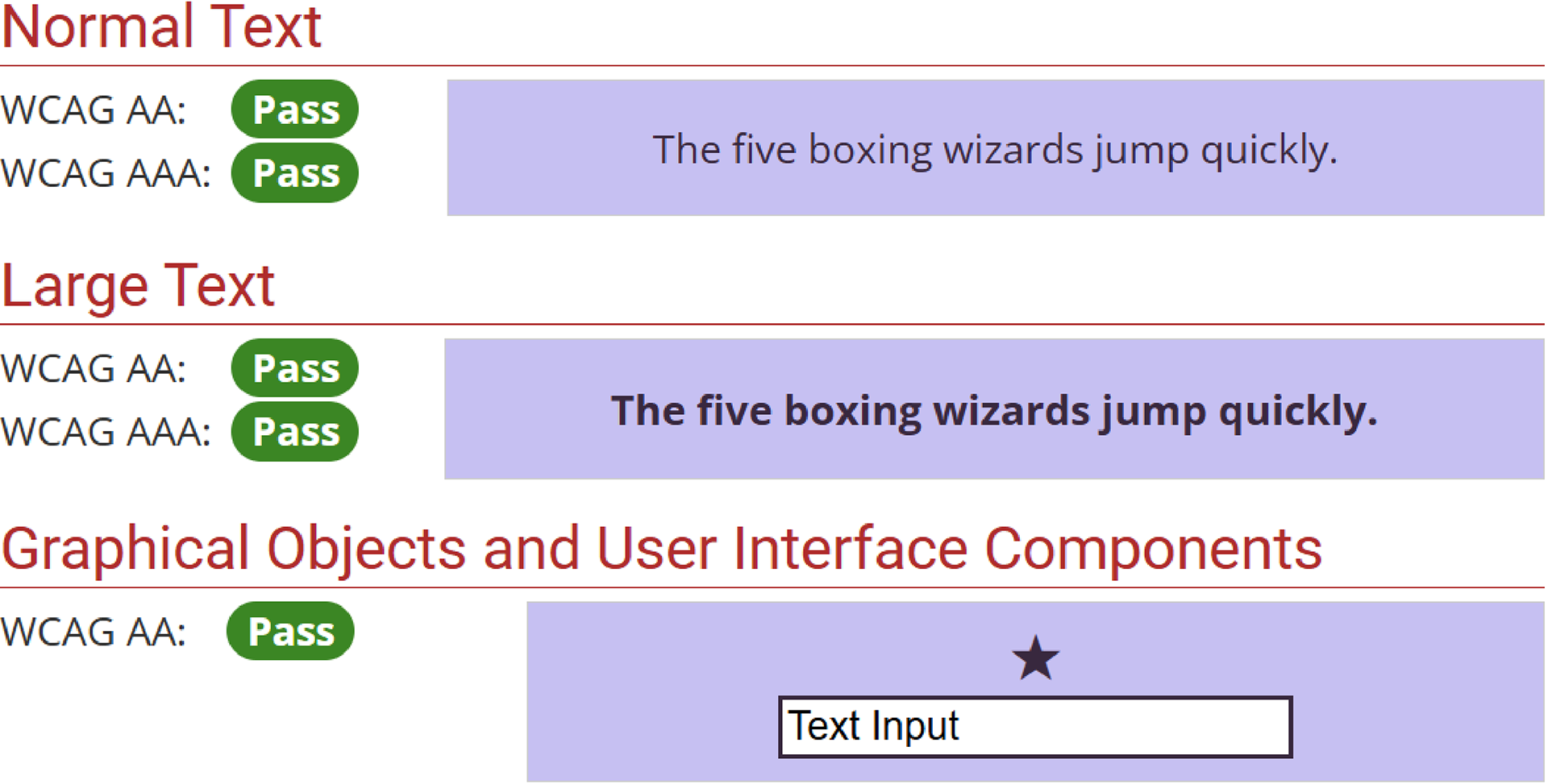
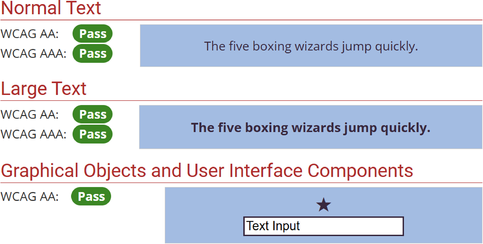
Improved Accessibility → Achieved WCAG AAA color and contrast compliance for text and UI elements, ensuring readability for users of all ages and abilities.
Clearer Visual Hierarchy → Replaced drop-shadow buttons with outlined styles, which made calls to action easier to recognize and gave the interface a cleaner, modern look.
Faster, Simpler Flows → Optimized data logging (hydration, medication, mood, symptoms) to be completed in 1–2 taps, reducing effort and encouraging consistent use.
Validated Through Testing → Usability feedback confirmed that design refinements improved clarity and reduced friction, especially for older adults and neurodivergent users.
Reflection
This project reinforced the importance of designing with accessibility as a foundation. If expanded, next steps would include extended usability testing across diverse user groups, integration with wearable devices for health data syncing, and further exploration of gamification to encourage habit consistency. This experience strengthened my ability to translate user research into inclusive, real-world solutions.