Project Summary
Project: Donation & Volunteer Page Redesign
Client: Elephaid Foundation (Nonprofit for elephant conservation)
Role: UX & UI Designer
Tools: Figma, Adobe Illustrator, Usability Testing
Overview
Elephaid Foundation needed a mobile app redesign to improve how users donate and volunteer. The original experience had major usability issues — users faced broken pages, cluttered forms, and unclear calls to action. My role was to redesign both the donation and volunteer flows to be clean, intuitive, and accessible while preserving the emotional impact of Elephaid’s mission.
Goal
- Simplify the donation and volunteer signup processes
- Improve accessibility and usability
- Create a clean and consistent mobile interface
- Align user actions with business outcomes (increased donations and engagement)
Target Audience
To ensure Elephaid met the needs of its diverse users, I identified two primary personas based on the client’s goals: Kaitlyn Wilson and Sarah Miller. These personas helped guide design decisions around app features, content, accessibility, and user flows—ensuring the experience was relevant, intuitive, and emotionally resonant for both volunteers and donors.

Kaitlyn Wilson, 28
Occupation: Server
Education: Some college
Traits: Passionate about animal welfare, likely to volunteer time and energy
Behavior: Frequently interacts with the app; has more available time
Kaitlyn is a hands-on advocate for animal welfare. She actively looks for opportunities to contribute through volunteering and community engagement. To support Kaitlyn’s motivation, Elephaid includes features like:
- Volunteer sign-up flows
- Event notifications
- Forums for sharing rescue stories
- Gamification elements (e.g., badges for participation)
- Event notifications
- Forums for sharing rescue stories
- Gamification elements (e.g., badges for participation)
This fosters a sense of community and helps Kaitlyn feel recognized and engaged.

Sarah Miller, 34
Occupation: IT Specialist
Education: Master’s degree in IT
Traits: Busy professional, prefers streamlined giving
Behavior: Engages less frequently with the app but contributes financially
Sarah is a career-focused donor who values simplicity and impact. Elephaid’s design for her centers on:
- Fast, intuitive donation flows
- Clear, concise information
- Progress reports and donation impact summaries
- Clear, concise information
- Progress reports and donation impact summaries
This ensures Sarah can support the cause confidently, without time-consuming navigation.
Impact On Elephaid's Development
By developing well-defined user personas, I was able to guide Elephaid’s strategic decisions across feature prioritization, UX design, content planning, outreach, and personalization.
Featured Prioritization:
Focused development on two core needs: Kaitlyn’s desire for community and participation, and Sarah’s need for fast, seamless donation workflows.
User Experience (UX) Design:
Balanced an engaging, interactive volunteer experience for Kaitlyn with a clean, efficient donation flow for Sarah, ensuring both users had frictionless, mission-aligned interactions.
Content Strategy:
Crafted content to foster community and storytelling for Kaitlyn, while delivering impact-driven updates (like donation summaries and infographics) for Sarah.
Marketing & Outreach:
Tailored outreach channels:
- Social and event-based engagement for Kaitlyn
- Email campaigns and data-focused messaging for Sarah
- Email campaigns and data-focused messaging for Sarah
Personalization:
Introduced user-specific experiences: gamified badges and volunteer forums for Kaitlyn, and tailored donation impact reports and preset giving options for Sarah.
Problem Areas and Key Usability Issues
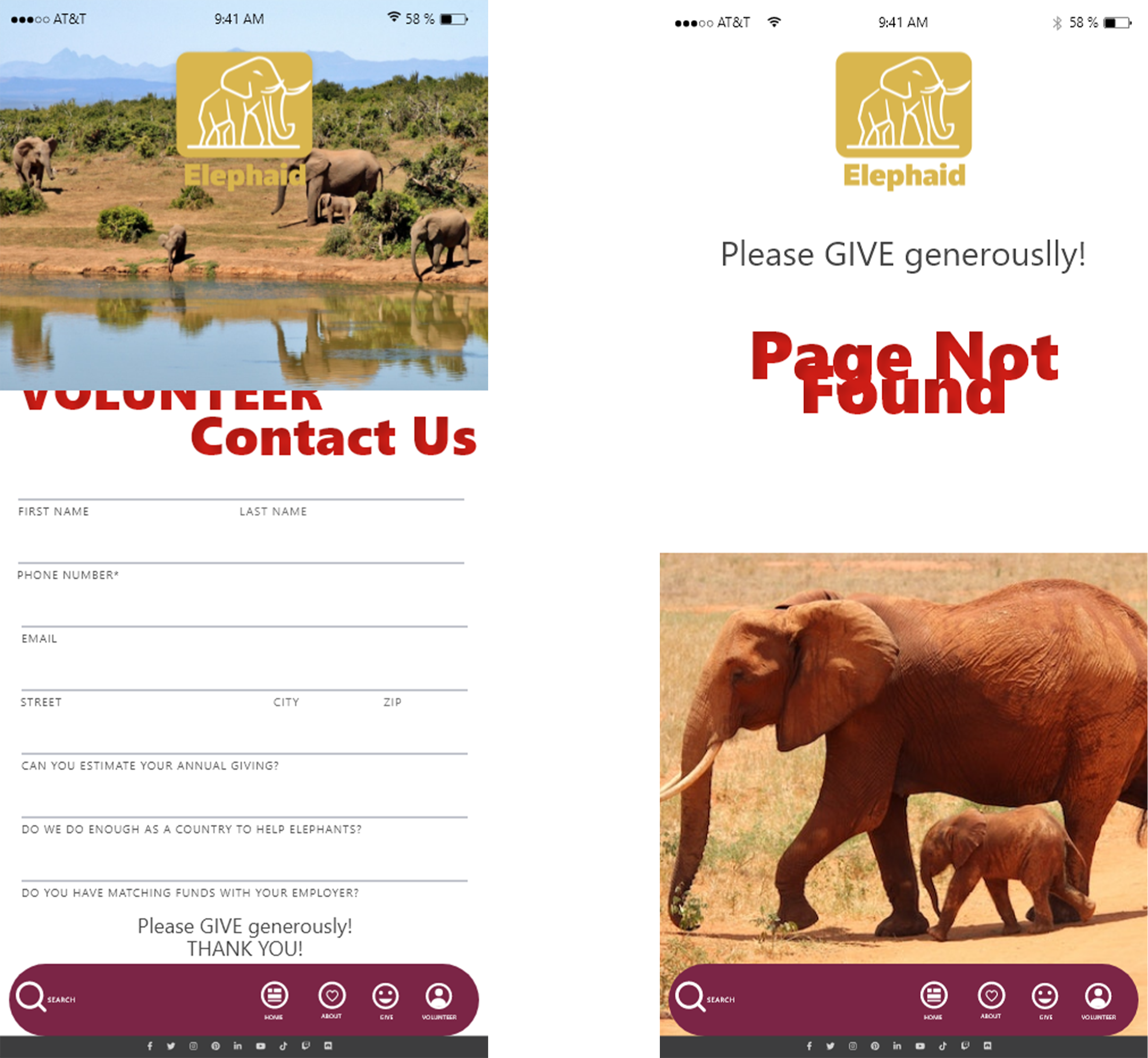
Donation Page:
Users encountered a "Page Not Found" error, completely blocking their ability to donate and causing significant frustration. This issue not only hindered users' ability to donate but also limited contributions.
Volunteer Page:
The cluttered layout made it difficult for users to navigate and register as volunteers. This poor design caused potential volunteers to abandon the process, as the lack of an intuitive layout deterred them from engaging further.
First Drafts
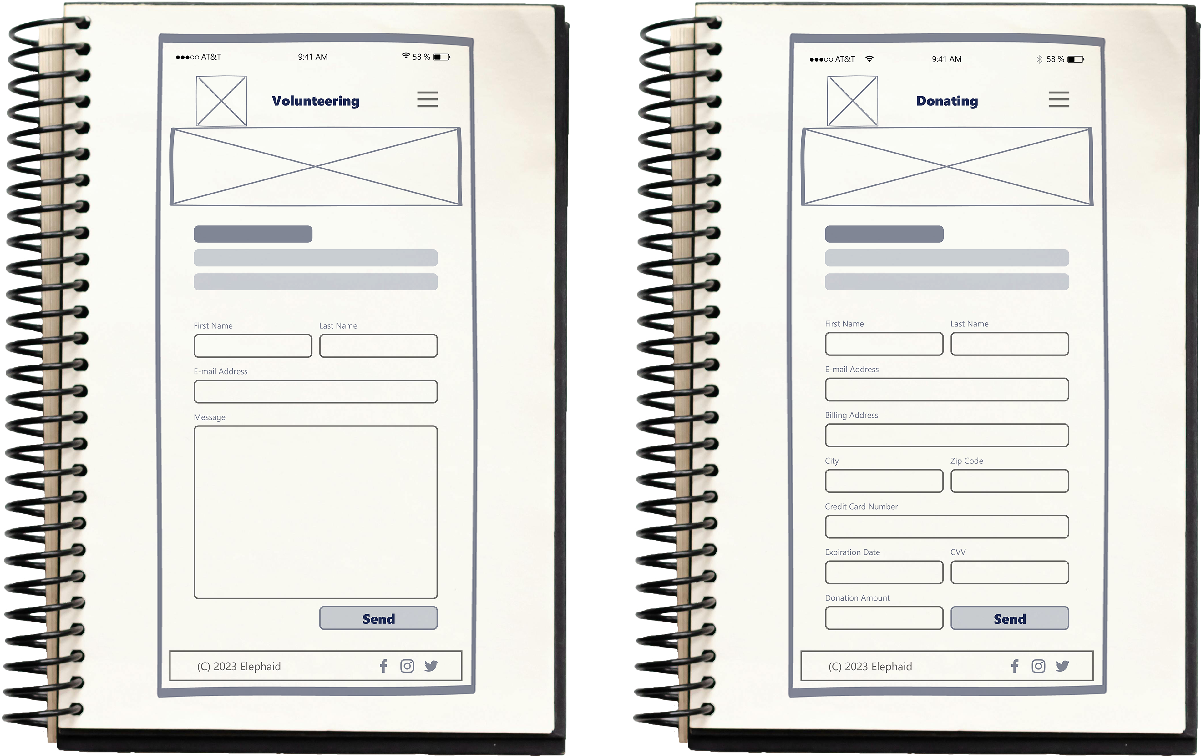
As part of the initial development process, we created low-fidelity wireframes for the donation and volunteering pages of the Elephaid app. These first draft ideas provide a basic layout and structure for the user interface design, emphasizing ease of use and consistency.
Both wireframes maintain a consistent design with the rest of the app, including the About Elephaid and Ways to Support pages. This uniformity in layout, color scheme, typography, and visual elements creates a cohesive and user-friendly experience throughout the app.
As the first draft ideas, these low-fidelity wireframes play a crucial role in ensuring that the donation and volunteering processes are intuitive and efficient. By providing a clear and consistent design from the outset, we can better meet user needs and encourage more support for Elephaid’s mission.
Solutions

Transitioned to high-fidelity mockups, ensuring a visually appealing design aligning with the client’s branding. Enhanced the user interface to provide a seamless, secure experience for donating and volunteering. Incorporated essential functionality to streamline the donation process and simplify volunteer registration.
Consistency in Design
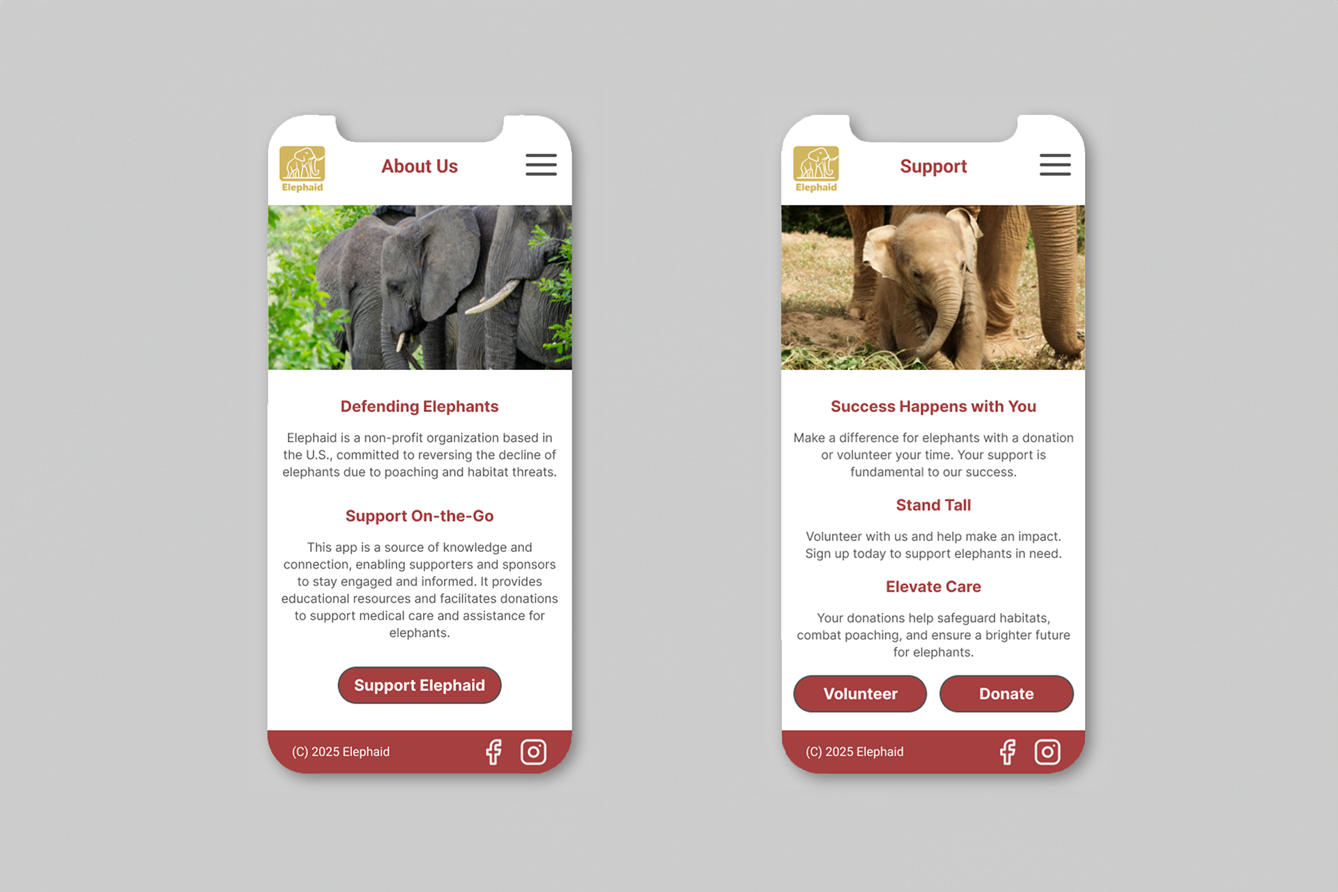
The About Us and Support pages maintain a consistent design with the rest of the app. This consistency is achieved through a uniform layout, color scheme, typography, and visual elements, creating a cohesive and user-friendly experience throughout the app.
Improvements to the Donation Page

1. Customer Info Page
- Streamlined Data Collection: Ensures that all necessary information is gathered in a single step.
- User-Friendly: Simple and straightforward, guiding donors through the process without overwhelming them.
- Clarity: Provides clear instructions and prompts, reducing confusion and errors.
2. Payment Page
- Security: Ensures that payment details are collected safely and efficiently.
- Flexibility: Allows donors to review and adjust their donation amount before finalizing the transaction.
- Efficiency: Provides clear instructions and an easy-to-navigate layout, making the payment process quick and hassle-free.
3. Confirmation Page
- Reassurance: Confirms that the donation has been successfully processed, providing peace of mind to donors.
- Transparency: Displays detailed transaction information, including the donation amount and transaction ID.
- Engagement: Encourages donors to stay connected with Elephaid through social media and provides a clear point of contact for any queries.
Improvements to the Volunteer Page
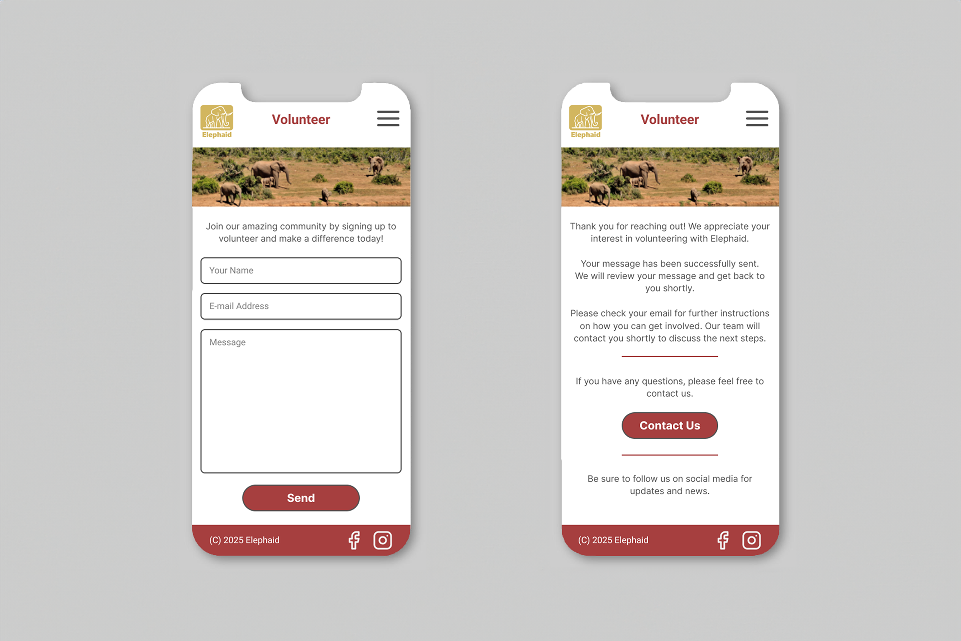
1. Volunteer Sign-up Page
- Streamlined Data Collection: Gathers all necessary information in a single step.
- User-Friendly: Simple and straightforward, guiding volunteers without overwhelming them.
- Clarity: Provides clear instructions and prompts, reducing confusion and errors.
2. Volunteer Confirmation Page
- Reassurance: Confirms that the sign-up form has been submitted, providing peace of mind to volunteers.
- Transparency: Displays detailed submission information.
- Engagement: Encourages volunteers to stay connected through social media and provides a clear point of contact for any queries.
Outcomes & Results
Simplified Donation & Volunteer Flows → Reduced friction in the process by creating clearer navigation paths for donors and volunteers, making actions easier to complete.
Improved Accessibility → Applied WCAG standards to ensure text contrast, button sizing, and visual hierarchy supported diverse users, including those with vision or cognitive challenges.
Consistent Visual System → Established a unified design language across screens, strengthening brand identity and reducing confusion in transitions between tasks.
Usability Feedback Integration → Iterative testing confirmed that streamlined layouts and predictable flows improved overall clarity and user confidence.